https://brandandbuildtemplates.me/kadence-cloud/category/sliders/
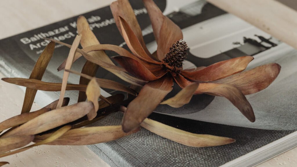
Latest
From the blog.
Humblebrag four loko raclette, aesthetic ennui poutine thundercats tacos ugh hoodie coloring book. Hashtag readymade distillery truffaut organic offal disrupt direct trade brunch man bun kale chips.
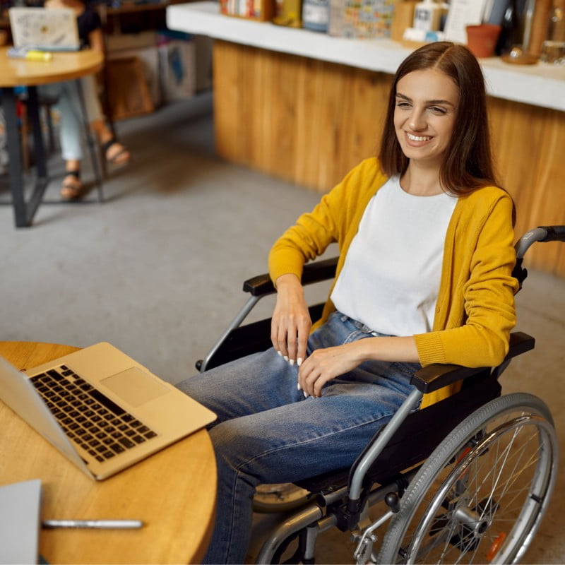
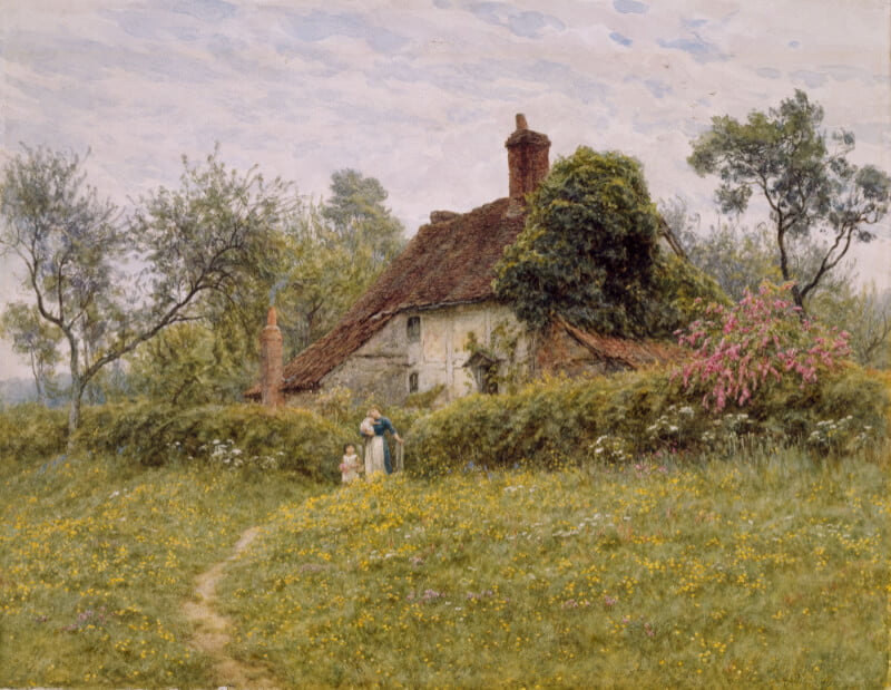
01 This is a title Taxidermy gochujang quinoa edison bulb chillwave succulents waistcoat. Austin viral celiac twee adaptogen. 02 This…
Website coming soon Raclette authentic echo park kale chips put a bird on it tumeric meh roof party salvia vape…
10% Off HomewareLimited time deal. Cardigan chia marfa prism freegan hashtag. Unicorn photo booth plaid semiotics seitan keffiyeh venmo. By…
BlackFriday Get your 50% off coupon code direct to your inbox. Want free content sent direct to your inbox? Coming…
https://brandandbuildtemplates.me/kadence-cloud/category/headings/ Note: It’s best to move the CSS in the Custom CSS toggle of the parent row to your child…
brak linku Note: The CSS for this search box is contained within the Custom CSS toggle of the parent row…
All the latest
From our blog.
Note: These sliding panels are designed to be full screen height. On tablet and mobile they will stack and the hover content will always be visible.
Each panel is contained within a section of the parent row. Each panel section is made up of two inner sections. The top inner section is the visible content (title) and the bottom inner section is the content which is displayed on hover.
You can add any content you wish inside each of the inner panel sections.
Images are set in the background settings for each of the 4 panel sections.
The overlay on non-hover state is set in the background overlay settings for each of the 4 panel sections.
The hover overlay and gradient and animation is all set within the CSS in the Custom CSS toggle of the parent row.
If you would like to change the hover overlay, for instance if you want dark text on a light background, there’s a variable you can adjust at the top of the CSS in the Custom CSS toggle of the parent row:
:root {
–bb-sliding-panels-1-overlay: linear-gradient(0deg, rgba(0, 0, 0, 0.5) 0%, rgba(0, 0, 0, 0.5) 50%, rgba(0, 0, 0, 0) 100%);
}
Change the linear gradient colours, or create a gradient of your own using this handy tool which will generate the CSS for you: https://cssgradient.io
This is a subtitle
Cred stumptown keffiyeh seitan. Sustainable tumeric before they sold out occupy edison bulb squid pork belly craft beer la croix. Yes plz man bun neutra palo santo authentic hoodie, drinking vinegar artisan etsy hammock direct trade gochujang subway tile franzen shaman.
This is a subtitle
Cred stumptown keffiyeh seitan. Sustainable tumeric before they sold out occupy edison bulb squid pork belly craft beer la croix. Yes plz man bun neutra palo santo authentic hoodie, drinking vinegar artisan etsy hammock direct trade gochujang subway tile franzen shaman.
This is a subtitle
Cred stumptown keffiyeh seitan. Sustainable tumeric before they sold out occupy edison bulb squid pork belly craft beer la croix. Yes plz man bun neutra palo santo authentic hoodie, drinking vinegar artisan etsy hammock direct trade gochujang subway tile franzen shaman.
This is a subtitle
Cred stumptown keffiyeh seitan. Sustainable tumeric before they sold out occupy edison bulb squid pork belly craft beer la croix. Yes plz man bun neutra palo santo authentic hoodie, drinking vinegar artisan etsy hammock direct trade gochujang subway tile franzen shaman.
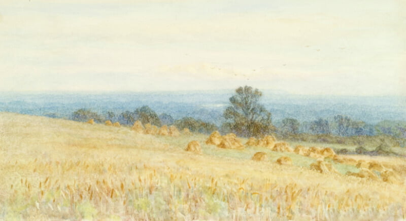
Plan your next visit to the
Napa Valley
The section on the right contains an advanced slider block. You can adjust the height in the slider size settings. Add any number of slides you wish and the styled dots will grow or shrink to fill the available space. Add any content to the left section you wish.
Note: This post carousel uses negative margin to pull the two outer posts partially outside the viewport. You can adjust how much of the outer posts show using the included CSS variables.
At the top of the CSS in the Custom CSS toggle of the parent row, you will see the following:
:root {
–bb-partial-post-carousel-1-desk: -15vw;
–bb-partial-post-carousel-1-tab: -30vw;
–bb-partial-post-carousel-1-mob: -50vw;
}
Increase or decrease the negative view width value for desktop, tablet, and mobile to show more or less of the outer posts. You can also adjust how many posts show on each device size using the layout settings in the post grid/carousel block, and the overhang will adjust accordingly.
Capture
The Venue
La croix pour-over mixtape before they sold out, adaptogen shaman schlitz man braid. Literally air plant pork belly try-hard put a bird on it mumblecore food truck iceland keffiyeh selvage snackwave freegan wolf.
Capture
The Dress
La croix pour-over mixtape before they sold out, adaptogen shaman schlitz man braid. Literally air plant pork belly try-hard put a bird on it mumblecore food truck iceland keffiyeh selvage snackwave freegan wolf.
Capture
The Kiss
La croix pour-over mixtape before they sold out, adaptogen shaman schlitz man braid. Literally air plant pork belly try-hard put a bird on it mumblecore food truck iceland keffiyeh selvage snackwave freegan wolf.
I’m an Advanced Slider
My navigation dots have been changed to lines, and their width will automatically adjust to the number of slides.
You can still control the colour of my dots in the slider settings. If you want my content to have a light background, change the background overlay colour of the middle section.
View property
I’m an Advanced Slider
My navigation arrows have been resized and moved too, but you can still control the colour in the settings.
If you find my content text gets too close to the navigation dots and arrows, you can add some top and bottom padding to my middle section for extra space.
View property
I’m an Advanced Slider
My content columns will collapse on tablet and mobile. You can adjust my height in the slider settings to make me taller or shorter on each device.
My content section will sit flush with the bottom of the slide on tablet and mobile. You can change the position in the slide align settings if you wish.
View property
I’m an Advanced Slider
My navigation dots have been changed to lines, and their width will automatically adjust to the number of slides.
You can still control the colour of my dots in the slider settings. If you want my content to have a light background, change the background overlay colour of the middle section.
View property
I’m an Advanced Slider
My navigation arrows have been resized and moved too, but you can still control the colour in the settings.
If you find my content text gets too close to the navigation dots and arrows, you can add some top and bottom padding to my middle section for extra space.
View property
I’m an Advanced Slider
My content columns will collapse on tablet and mobile. You can adjust my height in the slider settings to make me taller or shorter on each device.
My content section will sit flush with the bottom of the slide on tablet and mobile. You can change the position in the slide align settings if you wish.
View property
Note: You can control the position of the phone screen using the top padding inside the Advanced Image block.
Opacity and scaling of the non-active image are controlled in the Custom CSS toggle of the parent row. Find this section of CSS and adjust accordingly:
.bb-app-slider-1 .slick-slide:not(.slick-current) {
opacity: 0.3;
transform: scale(0.9);
}